The JamBase Concert Poster Primer: Part 3
The New School of Concert Poster Artists
Introducing the all-stars of the modern print game.
By Nate Todd Oct 11, 2022 • 11:04 am PDT

The JamBase Concert Poster Primer
Welcome back to The JamBase Concert Poster Primer, our ongoing series about the amazing evolution of concert posters over the past 70 years.
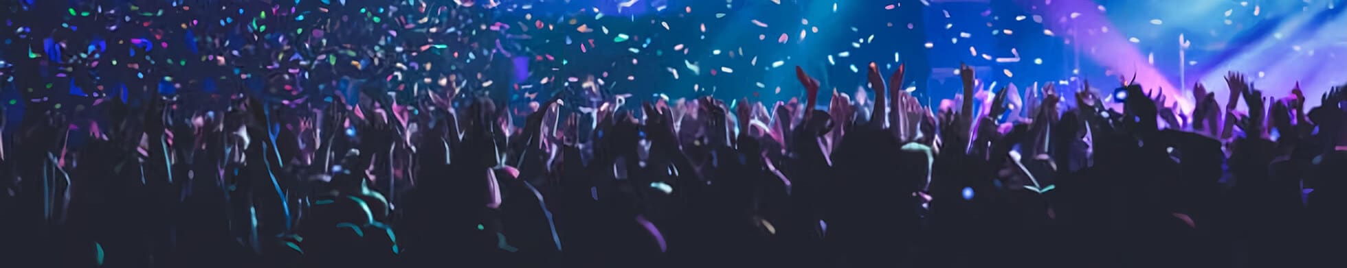
Rise Of The Modern Merch Poster
Imagine it’s 1980. You’re 18 years old. You’re on your own for the first time in a city with a legendary music scene. You stroll the streets to take in the nightlife of the downtown district. The sounds of music and laughter swirl around you. Crowds mill about in front of alternating twangy and thumping clubs. Suddenly you see someone different. They’ve got green, spiky hair. It’s one of those punk rockers, you think to yourself. They duck into an alleyway. You follow. What you experience thereafter opens up a whole new world.
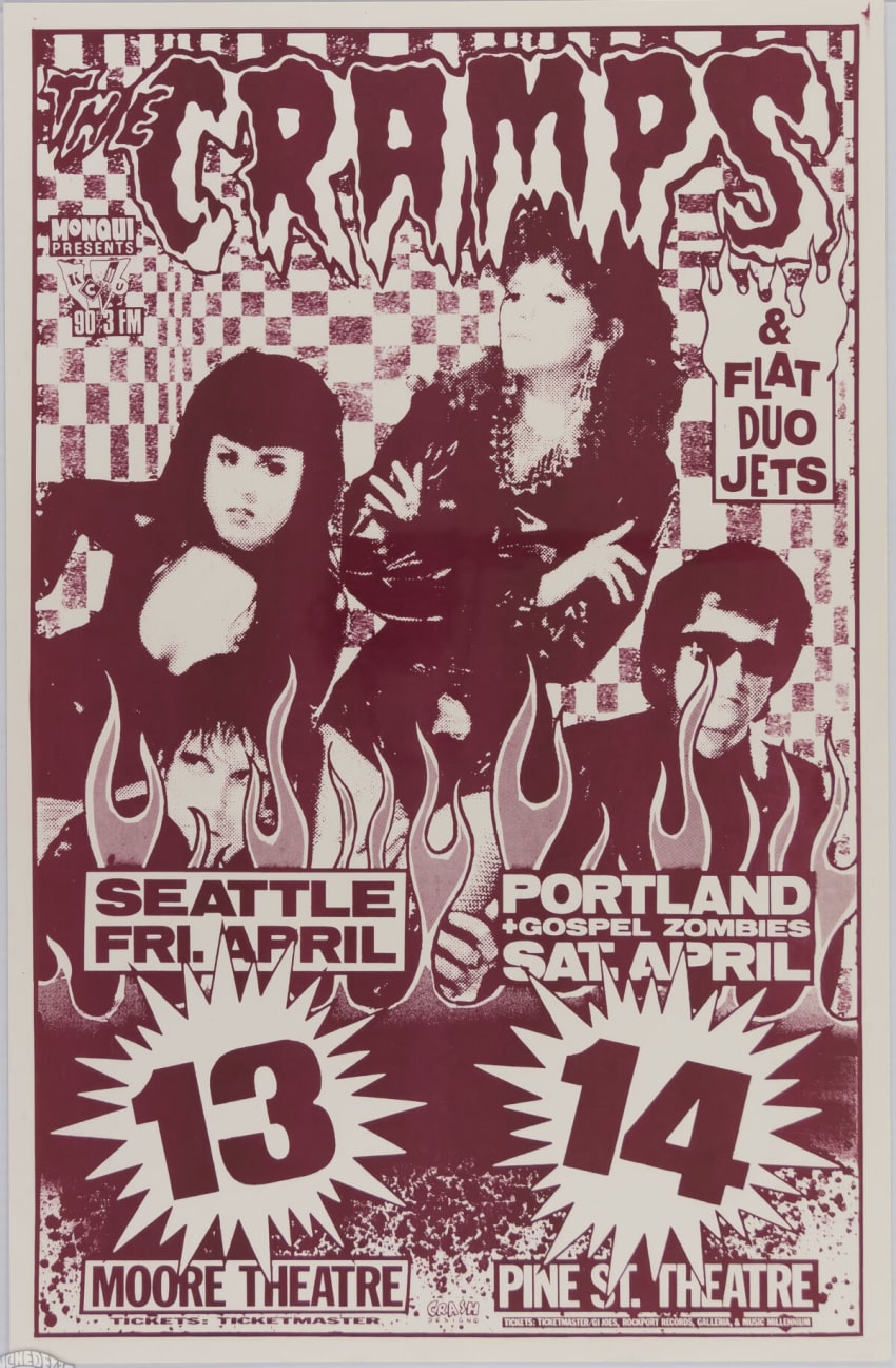
Poster artist Frank Kozik had a similar experience — relayed in a 2001 Texas Monthly profile — when he first moved to Austin, Texas as an 18-year-old airman stationed at Bergstrom Air Force Base. Encountering Austin’s punk rock scene put him on the path to becoming a renowned poster artist in the punk, alt-rock and grunge spheres. We met Frank in the second installment, The Continued Rise Of Concert Poster Art 1970s – 1990s, of a four-part JamBase Concert Poster Primer series in partnership with Psychedelic Art Exchange — the premier source to buy, sell, and learn about vintage concert posters. This third installment in the series takes a look at The New School of Concert Poster Artists.
Sponsored By

Kozik, along with with his contemporaries Mark Arminski, Chris Cooper (Coop) and others, are often pointed to as reviving the artistry that characterized the concert poster in the psychedelic ‘60s — examined in Part 1 of the series — as the artform had largely stagnated in the ‘70s and into the ‘80s save for a few bastions, Kozik’s adopted hometown of Austin being one. The 1988 reopening of The Fillmore in San Francisco also gave the poster world a boost.

Courtesy Of Psychedelic Art Exchange

Courtesy Of Psychedelic Art Exchange

Kozik - Courtesy of Psychedelic Art Exchange

Coop - Courtesy of Psychedelic Art Exchange

Arminski - Courtesy of Psychedelic Art Exchange
Rock becoming big business in the ‘70s played a major role in the decline of artistry in concert posters. Punk rock, new wave, and later grunge and alternative rock, were reactions to the commercialization of rock in the ‘70s. If rock was commercialized in the ‘70s, it was corporatized in the go-go ‘80s.
Capitalism reigned supreme. While genres like punk and grunge rebelled against commercialism in their art, this ironically only made them more popular with a demographic that had money to blow: teenagers. Merchandising for big bands, including t-shirts and commemorative posters, became big business. If the music itself was commercialized in the ’70s, now the whole universe around a group could be monetized — one factor in the rise of the modern merch poster.
Moreover, just as radio and print led to less poster usage for actual advertising purposes in the ‘70s, in the ‘90s, the internet played a similar role. Online promotion was yet another avenue leading to the rise of the modern merch poster.
But the merch poster wasn’t necessarily a product of the ‘80s and ‘90s. One of the first commercially available posters came out of the psychedelic era — the 1967 Monterey Pop Festival. Additionally, boutique companies like East Totem West — who created psychedelic poster-style art for art’s sake in the late ’60s — along with blacklight and headshop posters, marked a few instances of posters sold as art rather than used as advertising.

But with the rise of screenprint artists like Frank Kozik and others, the merch poster took off in the past 30 years. Kozik worked mostly in the alt-rock scene for artists like Nirvana, Red Hot Chili Peppers, Soundgarden and Pearl Jam. While he created posters advertising concerts, Kozik’s techniques and artistry ushered in a new wave of poster artists with the screenprint as their primary medium.

Kozik - Courtesy of Psychedelic Art Exchange

Kozik - Courtesy of Psychedelic Art Exchange
Screenprint Is King
Screenprinting is now the industry standard when it comes to merch posters. The technique, however, is not new. Screenprinting, also called silkscreen printing, originated in China roughly 1,000 years ago during the Song Dynasty. Basically, the technique centers around the concept of stenciling and involves forcing ink through mesh onto a substrate save for where the screen is made impermeable by a blocking stencil. Different colors are applied one at a time by using different screens and stencils to direct each color. Introduced to the West in the late-1700s and utilized, for the most part, in commercial printing afterward, Andy Warhol is credited with popularizing screenprinting in the modern art world in the 1960s.
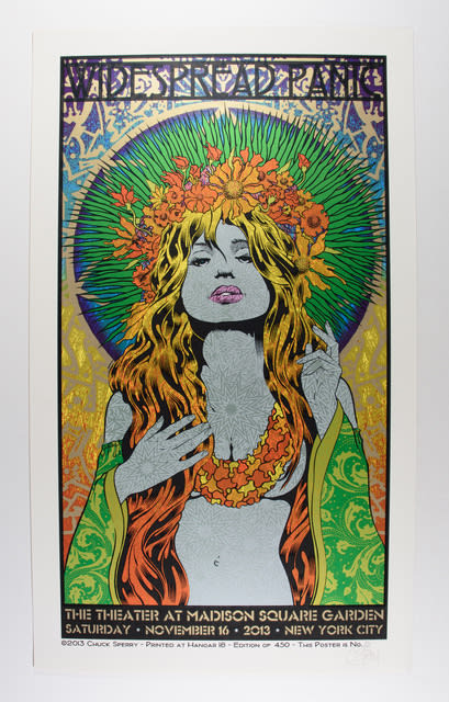
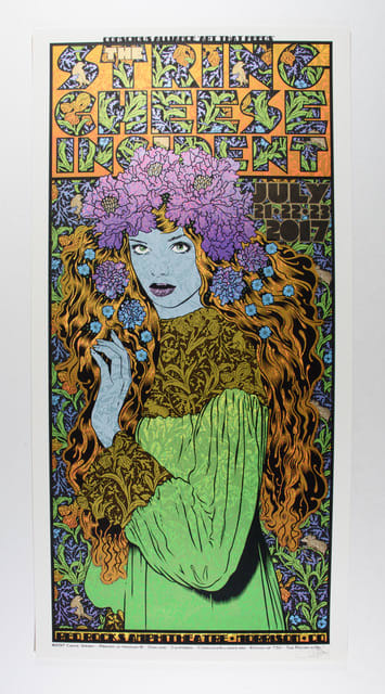
Thirty years later, poster artists like Chuck Sperry — co-founder of The Firehouse Kustom Rockart Company — and EMEK continue to advance screenprinting techniques, making them the “All Stars of the modern print game,” as per Glen Trosch, owner of Psychedelic Art Exchange.
“[Sperry] prints all of his own work [and] has taken screen printing to the next level,” Trosch continued. “Chuck is a gifted illustrator but beyond that, printmaster extraordinaire. Wearing both hats, [Sperry] has taken printmaking to a new level. Not only are the designs appealing, but the use of modern inks, papers and printing techniques — multi-color screenprinting and layered masterworks — leveled up the game.”
The early ‘90s also saw the rise of what would come to be called the jam band scene, which began to take shape around groups like Phish and Widespread Panic. Both bands were on the first H.O.R.D.E Tour — often pointed to as the beginning of the jam band scene — in 1992 along with one of the tour co-founders, John Popper and Blues Traveler, as well as Col. Bruce Hampton’s Aquarium Rescue Unit and others.
Sperry - Courtesy Of Psychedelic Art Exchange
Sperry - Courtesy Of Psychedelic Art Exchange
Artists began to cultivate relationships with certain bands. One of the most fruitful and famed of these collaborations was between Phish and Jim Pollock. As the jam band scene developed throughout the 1990s and early-2000s, it provided a plethora of bands for poster artists to land commissions. Artists like Sperry and EMEK began to collaborate with groups in the jam world.

EMEK - Courtesy of Psychedelic Art Exchange
Much like the bands themselves, the artists started to enjoy a degree of cult celebrity. Adding to the artists’ allure was that many of their commissions were and are released as limited edition runs sold at shows or released as “poster drops.” These “poster drops” gave artists a chance to market their work independently, basically being paid in prints that sell out within minutes. Along with Sperry, EMEK, Pollock and Marq Spusta, a new school of poster artists began to emerge. But who are these artists? How did they come to be concert poster artists? What and who inspires them? How do they approach commissions?
In Their Own Words
JamBase and our partners at Psychedelic Art Exchange reached out to a number of these artists to gain some insight into the mind of a concert poster artist. As poster artists exist mostly in the visual art realm, how artists bridge the optical and the auditory was an interesting aspect of how artists came to the concert poster craft.
“I’ve always loved how visual art can have a connection to music,” artist Pete Schaw said. “When I was a kid I had Iron Maiden posters all over my room even before I had even listened to them. The same was probably true for my initial love of the Grateful Dead. I think I first wore a Steal Your Face shirt when I was in the eighth grade, not because of the music but because I thought it looked badass.”

Pete Schaw

Pete Schaw

Pete Schaw
Here’s a bit on artist Owen Murphy’s formative era:
“I was attracted to poster art from an early age. I’d flip through the posters at the record stores on the boardwalk where I grew up and even did projects in high school that were relative to it. Once I started studying graphic design and illustration in college, it furthered my curiosity. It was a cool medium that blended the things I loved outside of art. It’s been a snowball rolling down the hill ever since.”

Owen Murphy

Owen Murphy
Phish collaborator Jim Pollock also spoke about how he found himself in the world of concert poster art.
“Poster art got me into poster art. The stuff from Haight Ashbury was really cool to me. Things you’d see in record stores or on the bedroom walls of my friends’ older brothers or sisters. And in the back of Underground Comics, there were ads selling classic prints and posters. I never had any but thought they were cool. Then in art school, I studied lithography and got really into those 19th-century French art posters from Toulouse Lautrec. That was all the inspiration, but how I actually became a poster artist is a different story. I had been drawing comics and designing merch for my friend’s band (Phish) for a while and that eventually morphed into printmaking.”

Jim Pollock

Jim Pollock

Jim Pollock
Pollock also detailed how a band’s input or music influences (or doesn’t) his work:
“Sometimes they send along ideas and I riff on that. Other times I just rely on my imagination. It runs kinda wild … Music’s FEEL could inspire the feel of the art, but usually, specific song elements do not. But, a couple of months back I did a poster for Goose at Radio City and I actually incorporated song lyrics into the design. They had sent us a link to their new album before it came out so I listened to it a lot in the studio and their song ‘Hot Tea’ inspired the print. If you look at the small details you can see the lyrics in the imagery.”

Jim Pollock
David Welker — who created the album art for Phish’s 1993 album Rift — spoke about his journey in the concert poster art scene:
“My career has had a few different phases over the last 35 years from gallery shows to itinerant mural painting from coast to coast. Being asked to do an album cover for Phish back in 1993 sort of planted a seed for poster work later on. I didn’t really get fully immersed into the poster scene until 2009 when I got a friendly push from an art collector in Chicago who made some introductions for me with some band management companies. Around this time I reintroduced myself to the new Phish creative director and got my first poster assignment for them in 2010. The floodgates were open. It was a thrill.”
“I usually try to pick one song as a focal point for inspiration,” Welker added on how a band’s music inspires him. “Once my pen starts moving, an idea jumps to the surface and I usually go with that first impulse.”

David Welker

David Welker

David Welker

David Welker
Artist Nate Gonzalez detailed a method similar to Pollock:
“So I will look at the style of the band, their visual and sonic style, lyrics, history, etc. to see if any inspiration can be found there to be used. Most of the bands I end up working for are in the jam band community and make beautiful, bright, energetic music, so working in a psychedelic style that lends to that visually usually seems to make sense. Sometimes there are lyrics that can be cherry-picked from songs for other elements in the design to help tie things together as well. But in the end, I don’t necessarily always let a band’s style dictate how my art looks, it’s important to me to just make what feels right and true to me.”

Nate Gonzalez

Nate Gonzalez
“I’ll usually listen to a few albums from said band (if I’m unfamiliar with them), just to get a vibe for their sound / style of music,” artist Luke Martin explained. “I feel like as an illustrator, it’s my job to take the band’s music and put it into a picture … how it sounds, how it makes you feel, the mood that it gives off… so I always try to have the poster match the aesthetic of the band, the best that I can.”

Luke Martin

Luke Martin
Owen Murphy on the creative process:
“I’m a student and total nerd with it. I enjoy looking at a piece up close and reverse engineering a process or technique as well as looking at the evolution from the earliest posters through modern times. Every time I go into Psychedelic Art Exchange I’m like a kid in a candy store.”
Some artists take a different slant, opting to come up with ideas before cracking open the music. Here’s U.K. artist Drew Millward’s take:
“It really depends, but I try to formulate an idea before really delving into the band’s sonic and visual identity. It may seem like a backwards way of doing things, but starting anything with a blank page can be a daunting prospect, so having a rough idea or foundation, allows me to then build from that, once I’ve investigated things further…
So there is a balancing act of creating something that is fitting for the band or artist, yet still retains the signature of my work. I love working with a really diverse client base, from huge stadium bands to DIY punk bands, as it really shifts the parameters of the work I make. It keeps things fresh. Not every band requires the same poster or approach. If you are making the same poster for Metallica and Madonna, you’re doing something wrong, the balance is off.”

Drew Millward

Drew Millward
Mike King, who we met in Part 2 as one of the Pacific Northwest’s most prolific poster artists beginning in the punk era, looked more at a band’s visual aesthetic.
“The specifics of a band’s music (unless I am already familiar with it) has no input of what I do,” King noted. “I am interested in how they present themselves visually and am not really interested beyond a basic genre description of what they sound like (country, metal, polka). If I don’t like a band’s music, it’s harder to make a good poster, so I avoid that by not listening to most of the bands I make posters for.”
Courtesy Of Psychedelic Art Exchange
Some creators go in the complete opposite direction of what the commission asked for, often with hilarious effects, as the artist known as Not Pollock did. “The person I was working with asked that I not use a white tiger in the design, so I immediately got started creating a concept with a white tiger.”

Not Pollock
While the artists’ methods are wide and varied, there is a collective consciousness underpinning the concert poster art world, as Welker noted, commenting on both poster art’s unique history as well as its future:
The convergence of the cultural timestamp of the event, the musicians and their lives and careers, the artists and their careers, the concertgoers, the documentation itself, and the continual movement of all of these entities and realities moving forward in time and the huge cultural relevance of history itself and nostalgia and the sentimentality of the human character makes it more powerful than many observers, participants, journalists, and art critics can even comprehend or understand. To define the significance of this medium in this time as an art form will only be fully realized a century or more from now.
Naturally, artists are also fans of art, and some cross over into collecting as well.
“I have a small collection of classic psychedelic poster artists (mainly thanks to the Psychedelic Art Exchange) and love looking back to the art of those who laid down the foundation and learning from them,” Nate Gonzalez noted. “I think it’s fun that most of the classic posters from the ’60s tried to make their lettering illegible so that people would have to stop and stare at the prints to read them, and of course Moscoso’s discovery of making his prints ‘move’ in the dance halls under flashing colored lights (Which is something I have experimented a lot with as well).”
Add It To Your Collection
As concert poster art has progressed, so too has concert poster art collecting. As we learned in Part 1, people have collected poster art for as long as the modern poster has existed, stretching back to the 19th century. But over the past 50 years, concert poster art collecting has emerged as a bonafide trade, on par with fine art. But like fine art, concert poster art collecting takes a sharp eye, a shrewd business sense, and dogged determination.
There are two main branches of collecting. First, there are those who trade in vintage posters, gathered in the wild, that were actually used for concert promotion. Because these posters have seen action, condition becomes a factor in determining monetary value. Pyschedelic Art Exchange noted that “value is determined by condition, scarcity and desirability.”
Condition, scarcity and desirability also come into play, albeit a bit differently, in the other branch of concert poster art collecting: the modern print phenomenon, characterized by the folks who come to shows early and wait hours in line to get “tonight’s print.” These posters are not used for promotion. Nobody actually posts these crisp creations signed by the artist. They are posters in name only and are sold as merchandise. There are two schools in the modern print phenomenon as well: fans who collect the posters and “flippers” who trade in them.
JamBase and Pyschedelic Art Exchange also contacted a number of prominent concert poster art collectors. Curator and art dealer Brian Chambers, of The Chambers Project, shared insightful thoughts on collecting.
“As a collector of posters I’m always seeking the best possible copy with the best available signature,” Chambers said on his personal collecting preferences. “Obviously you always want the nicest and rarest variants when collecting concert posters and when collecting originals I always go for the trophies.”
“Condition and provenance first and foremost,” Chambers continued. “I always go for pieces that are visually stunning and are rich with history. The more iconic it is and the better the story that can be told about it definitely makes for a winning formula and strong desire for purchase. Landing a masterpiece provides a sort of magic feeling that is undeniable and quite profound.”
Chambers also weighed in on the modern print phenomenon when asked about how concert poster art collecting has evolved as well as the future of poster art collecting:
“I think the future of concert poster collecting will likely continue for the foreseeable future in the same way it’s been in recent years with the two polar opposites of collecting classes: the flippers and the genuine fanatical collectors. I think the cat is out of the bag and the money is undeniable so there will continue to be a strong secondary market and thus immediate financial gains for those patient enough for the long lines at shows. I also see the die-hard collectors who want and need everything their favorite bands or artist produce in their archive as a staying breed. The avid collectors don’t seem to be going anywhere and those committed and patient enough to build the ultimate collection of pristine copies will ultimately be paid more in the long run assuming they ever decide to let go of their collection which some people will never do. I’m not a fortune teller but these relics produced for epic shows by the most cutting-edge artists of today will always be time capsules that will remind the owners of these treasures where they were at and what they were experiencing at that juncture in their life and that isn’t ever going to change.”
In Part 4, we’ll take a deep dive into poster art collecting, where we’ll hear from prominent collectors and more. A number of those collectors will be in attendance at The Rock Poster Society’s (TRPS) annual show in San Francisco on October 15.
After a two-year hiatus, the event returns this weekend. Our partners at Psychedelic Art Exchange will have a booth. Stop by and say hello for giveaways, discounts and more. Vintage ’60s artists including Stanley Mouse, Victor Moscoso, Lee Conklin, John Van Hamersveld, David Singer, Randy Tuten, Norman Orr and Roger Dean will be on hand as well. Also in attendance will be modern print all stars Sperry, EMEK, Spusta, Owen Murphy, Luke Martin and others offering scarce and hard-to-find prints. For poster enthusiasts, TRPS will be a perfect lead in to our fourth and final JamBase Concert Poster Primer: Concert Posters As Collectables & Investments. Check out a few items from TRPS below including original artwork of Rick Griffin’s famed BG 105 (“Flying Eyeball”) as well as the TRPS 2022 poster by Roger Dean.

Rick Griffin BG - 105 Courtesy Of The Chambers Project

Roger Dean TRPS 2022 Poster